Mother Nature doesn't care about your weekends
May 1, 2024
Jonathan Bowers
CEO
Savannah Holmes
Marketing Coordinator
Seeing IS Believing (at least with data)
2023 had many significant events.
The wildfires in Maui Hawaii made headlines for weeks.
The WHO finally declared the end of the COVID-19 pandemic.
Barbie set box office records.
The Titan Submersible had the world holding its breath for days.
And Taylor Swift was named “Person Of The Year,” after the highest-grossing tour of all time: Eras.
Although you remember these events, how likely are you to know the exact dates they each happened? If you're a normal human like myself, the answer is probably, “Yeah right.” Thankfully, few of us need the timeline to build our highlight reel of 2023…but what about industries that do?
Those exploring wildfire activity don't just need comprehensive data to understand it - they rely on it to properly prepare and respond to each season. The problem is, until now, it's been just as difficult to identify critical dates and patterns for fire activity as it is to remember the day that Twitter became X.
What Google Flights And Wildfire Have In Common

Date picking is valuable for those who center their vacations around weekends, school breaks, special occasions, or holidays. But for an equal handful, the price is what decides when they'll fly. For these individuals, the precision of the date-picker view is a huge hindrance. The linear display of a single date prevents them from accessing the data that will influence their decision. When Google Flights introduced the full calendar view to their booking system, individuals could now interact with data that was most relevant to them in a seamless way.
When you need to book a flight on an exact date, the specificity of a drop-down menu provides the perfect framework for finding exactly what we're looking for. But in any other circumstance, it prevents it.
Wildfire data experiences the same challenges travelers used to face, with stagnant data trapped inside traditional date picking. This data is critical for proper prediction and preparation for each wildfire season - on both personal and provincial levels. However, the utility of data depends on its translation into understandable and useable information. And, when 365 clicks are required to see just a single year of wildfire activity, our one-click civilization isn't going to make it too far.
Data Decoded: The Need For Context In Fire Analysis

Not only does traditional date-picking require supernatural memory to pinpoint the exact day specific fire activity occurred, but it also isolates the data from context. Context is what we rely on to properly metabolize information. We demand comparisons and contrasts to make sense and assign meaning to the world. For example…
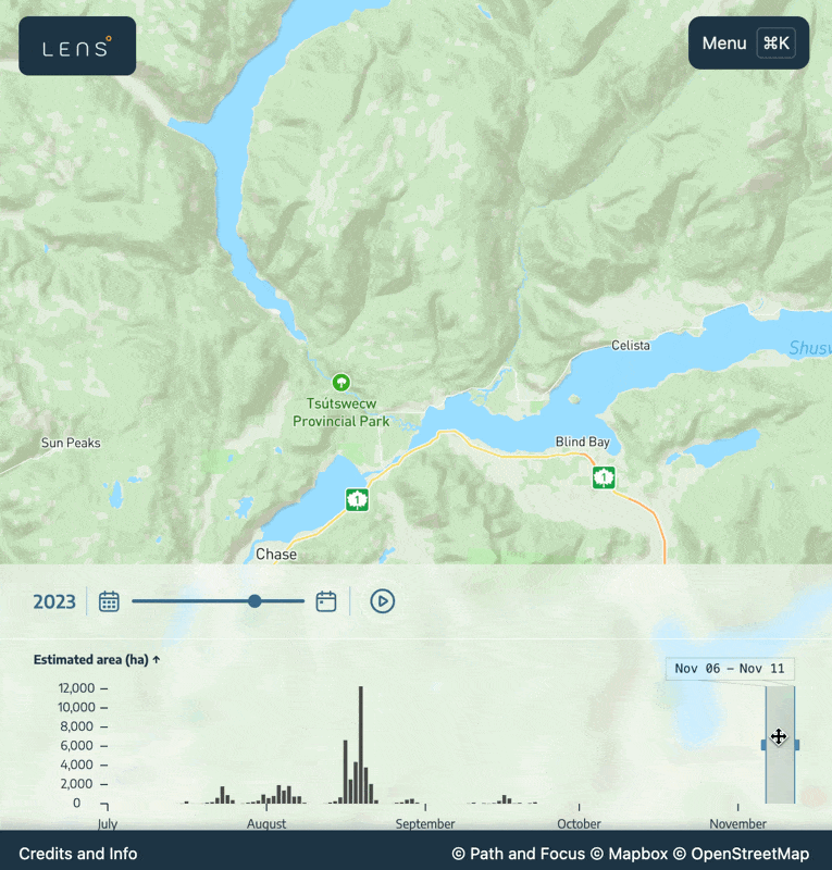
In 2023, the wildfire season in Canada burned 18.5 million hectares.
Logically, we know that's a lot. But without context and comparisons, it's just a random number. Say, however, we saw the 2022 wildfire season (which only burned 1,467,970 hectares, with a fraction of fire starts), in a histogram-based timeline. The visual comparison would provide the immediate realization that 2023 was a significant year for fires. Not only does it accelerate the examination of wildfire activity, but it helps identify hotspots, view patterns, and predict areas of future concern.
Context (especially when presented in multiple formats including visual or numerical), is what enhances the value of data. This is why wildfire datasets with linear date-picking aren't being utilized for proper wildfire prevention and preparation. We have the data but up until now haven't had a way of efficiently displaying, exploring, or understanding it.
By understanding and prioritizing user intent, we can create interfaces that truly serve their needs, whether it's for precision, exploration, or anything in between.
Exploring Data, Not Dates
The work of Path and Focus exists to treat the data as the way you interact with temporal data rather than time. It eliminates the painful (and almost impossible) necessity of memorizing dates and instead allows you to just look for clusters of data that seem interesting. *When* each of these events happens almost becomes insignificant.
Take the Bush Creek East fire in North Shuswap in 2023. You would be hard-pressed to guess the precise date that this fire was most active, especially when our memory of the outer world tends to be subjective to the state of our inner one. With traditional date-picking, you'd be required to individually insert dates, crossing them off one by one until you discover some abnormality. But, if the data is on a timeline you can see it right away and just scrub over to the dates to learn when it was most active.
Trend Spotting Made Easy
Not only is a base understanding of wildfire activity essential for members of the public, but it also serves a higher level for the professionals called to control the activity.
One fire expert, Thomas Martin, describes the waves of fire activity as, “sprints.” With timeline data, you can view this visually and quickly determine the trends.
Historically you would need to be a fire enthusiast with an understanding of its behaviours to identify these spikes, but with Lens, regular folks (such as ourselves) can detect them too. The ballon of fire activity in Western Canada on September 23rd 2023 was so extreme and noticeable that our team reviewed our software thinking it might've been a glitch. After further review and discussion with other industry experts, the activity corroborated.
https://twitter.com/nplareau/status/1706530877860425908 (FRP)
https://www.axios.com/2023/09/29/canadas-hellish-wildfire-season-defies-the-calendar (carbon)

Wildfire Data Needs To Be Faster Than The Flames
The approach of current wildfire data sets is restricted to specific date selections rather than an engaging histogram-based timeline. We need context, visuals, and a comprehensive view to identify hotspots, patterns, and irregularities in fire activity. This allows users to quickly identify and select periods of interest based on visible data trends rather than arbitrary calendar dates. The free tool Lens translates data from complex graphs to a rolling simulation. The result? A more natural, intuitive interface that aligns with the user's primary intent: exploration.
To implement Lens as a tool for understanding fire activity in your region (and beyond), join our monthly communications and receive critical information about our integration in your community.